Comparison Dashboard of Pre vs. Post 5G Launch in Atliqo Telecom Company
Overview
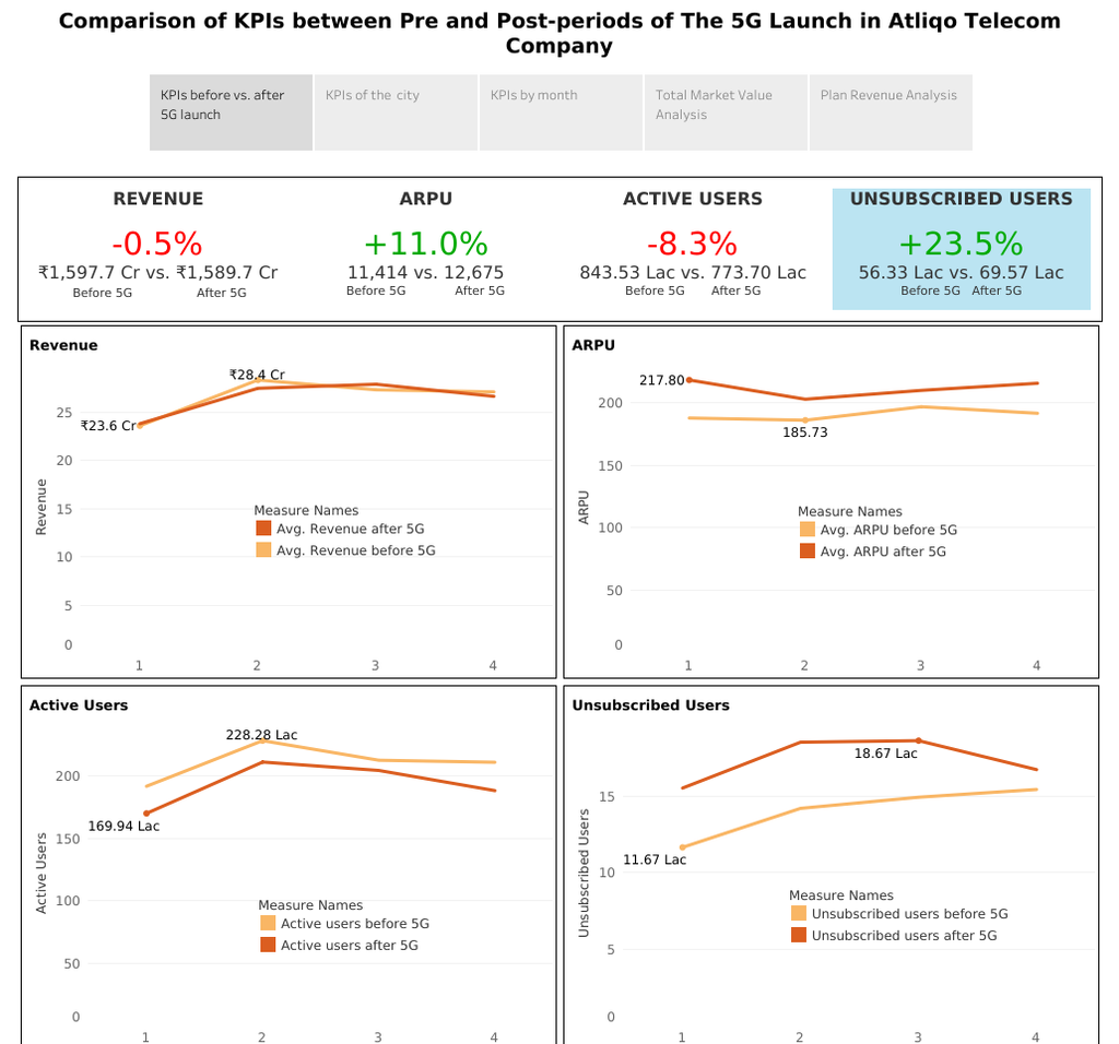
Built a Tableau report comparing 7 KPIs pre- and post-5G launch, revealing an 8.3% decrease in active user rate and enabling data-driven optimization of internet plans.
Background
Following the launch of 5G in May 2022, Atliqo Telecom Company experienced a noticeable decline in both active users and revenue growth. In response to these concerns, the business director requested the analytics team to conduct a comprehensive evaluation of the situation. This included preparing a comparison report of key performance indicators (KPIs) before and after the 5G rollout to understand the impact of the new technology on user engagement and business performance.
Methodology
- Data Exploration
- Conduct initial exploration of the dataset to understand its structure, contents, and quality.
- Identify key variables and assess data completeness and consistency.
- KPI Definition
- Define key performance indicators (KPIs) to measure performance changes before and after the 5G launch.
- Establish baseline metrics for pre-launch and compare them with post-launch performance.
- Question Formulation
- Develop a set of analytical questions to guide the investigation and derive meaningful insights.
- Align questions with business objectives and stakeholder interests.
- Data Visualization
- Create visual representations of key metrics and trends to facilitate understanding and highlight patterns.
- Use charts, graphs, and comparative visuals to support the analysis.
- Dashboard Design
- Sketch the layout and structure of an interactive dashboard.
- Plan components to effectively display KPIs, trends, and critical findings.
- Insight Extraction and Recommendations
- Analyze visual and statistical findings to extract actionable insights.
- Provide relevant, data-driven recommendations to support strategic decisions post-5G launch.
Conclusion
Loss of active users affects company revenue growth, a thorough investigation of what happened and identification of the root cause should be conducted as soon as possible. Key metrics measure the success of business activities that support KPIs. Analyzing KPIs’ performance over a period of time could help decision-makers identify areas for improvement, as well as suggest relevant recommendations.
Recommendations
- Users are attracted to purchase internet plan with daily data limit ranging from 1–3 GB. Hence selling more internet plan: p1, p11, p2, p3, and p12 could be a good choice, moreover these plans are profitable both before and after 5G launch.
- Reduce stock for internet plan: p8, p9, p10 for sales after 5G because users aren’t interested in purchasing it. These plans have shorter validity time and smaller internet quota. It is suggested to create more internet plan variation with minimum daily data limit of 1 GB and minimum validity period of 3 days.
- Ahmedabad, Delhi, Raipur, Patna, Mumbai were the top 5 cities with the highest % of active users lost, we need to identify the characteristic of users in each city to offer relevant internet plans.
- Analyze competitor recharge plans may assist the company in creating more innovative internet plans.
Categories
Objectives
- Generate actionable insights to help management make informed, data-driven decisions
- Identify key areas affecting the decline in active users and performance metrics
- Propose recommendations to optimize internet plans and increase user acquisition and retention
Tools & Technologies
Data Source
Atliqo's internet package sales data from Code Basic